Hover feedback that shows intent before you click
Create experiences with real engagement—stories that pull people in, toolz that feel good to use, games that stick with you.
Small interactions matter. Real-time feedback, gesture controls, animations that respond to what you're doing—all the mechanics that make something feel alive. When interaction doesn't fight you, people spend more time with it and actually care about what they're doing. PlayPilot handles the building blocks: scroll triggers that do something, hover states that feel anticipatory, animations that look responsive instead of decorative. Accessibility is built in from day one, not added later as an afterthought. Playful design without access is just exclusion.
Hover states that respond instantly, scroll triggers that fire at exactly the right moment. These micro-interactions pull people in instead of pushing them away.
Hover feedback that shows intent before you click
Parallax effect triggered by scroll, uncovering layers underneath
Input field that animates when active, without getting in the way

Swiping feels right on mobile, not like you're fighting the interface
Keyboard navigation and focus rings work from the start
Progress shows up immediately, with a little celebration
Wait 120 milliseconds between a click and anything happening, and the whole thing feels broken. But a button that shifts color when you hover over it? That feels like someone thought about it. The gap isn't just about looking polished—it's the difference between feeling like you're actually controlling something versus waiting around for the interface to do whatever it wants. PlayPilot builds these moments in from the beginning. Hover states that respond in 80 milliseconds. Scroll listeners that fire the exact instant content hits the viewport. Gestures that do something real instead of just sitting there looking nice. When people get immediate feedback, they know right away what their interaction did. No second-guessing whether the click went through. No hunting around for features that might be hidden somewhere. And because it's all designed with accessibility from the ground up—actual keyboard navigation, screen reader support, focus indicators that stick around—nobody ends up locked out of the experience. The flashiness isn't what matters. What matters is that responsive, alive interactions keep people around longer. They explore more. They come back. That's the real payoff.
Swipe through these or use the arrows. Keyboard works too if that's your thing. You'll see everything from indie game interfaces to enterprise platforms that actually feel good to use. The pattern's pretty clear once you look—engagement and accessibility aren't at odds. They're the same goal.


Focus indicators that work for everyone
Screen readers get the same information your eyes do
Motion preferences respected without losing feedback
Most teams treat accessibility like a checkbox. Keyboard support? Check. ARIA labels? Check. Done. PlayPilot flips that around. You start by assuming every single interaction has to work for keyboard navigation, screen readers, and mouse users. Then you layer in the stuff that makes it feel good—a hover state that shifts color, focus indicators that move smoothly through the interface, animations that respect when someone's asked for less motion. These aren't at odds with each other. A button can announce itself clearly to a screen reader and still give you that satisfying click feedback. Form inputs validate as you type and sound just fine when read aloud. The details matter: response times should land in the 2–3 millisecond range, focus indicators need at least 3:1 contrast, and every swipe action should have a keyboard alternative.
The real tension isn't between accessibility and playfulness. It's between lazy design and thoughtful design. When you build accessibility from the start instead of grafting it on later, you actually end up with better interactions because you're forced to think harder about what each element does and why it matters. That's where the engagement comes from. The moment someone notices the interface responding to them, anticipating what they want before they even click, it stops feeling like a tool. It becomes something they actually want to come back to.
You click something. For the next couple hundred milliseconds, nothnig happens. Did it work? Should you click again? That pause is where people check out. PlayPilot closes that gap. The second you interact, something responds. A loading state pops up. A number goes up. Colors change. The feedback is instant, specific, and tells you what happens next. Not flashy. Not in your way. Just actually responsive.
Here's the thing. When people see their action get acknowledged right away, they trust the interface more. They poke around. They come back. They stick around longer. Take form validation. Old way: you fill everything out, hit submit, then get told something was wrong. PlayPilot way: you see validation happen as you type. Email format looks good? Green underline shows up immediately. Password needs more characters? The red outline vanishes the moment you fix it. Checkmarks appear as each field clears. No second-guessing. No abandoning the form at the last second because you missed something. The user gets constant, specific feedback about where they stand. This isn't just throwing animations everywhere. It's taking what's invisible and making it visible.
Boring.
When someone gets good feedback from their actions, they stick around. Swipe through these 7 examples—or use arrow keys—to see how small animations and interactions actually drive engagement. Each one prioritizes accessibility without sacrificing personality.

Chat message fades in smoothly, timestamp appears as it arrives, and the read receipt shifts from 'sending' through 'sent' to 'read'

Swiping on mobile shows directional arrows and a slight vibration, then the card slides away to reveal what's underneath
Three dialogue options fan out when you hover over them, the cursor changes to a pointer and your choice gets highlighted with color and a subtle grow effect
Scrolling moves the text faster than the background image, creating depth, while a position indicator tracks your spot on the right side
Button goes through resting with a soft shadow, hovering with color change and slight growth, pressing with an indent, and disabled with a faded look and no-entry cursor
Tab through form fields and see a focus ring with strong contrast, screen reader announcements shown as text, and numbered tab order indicators
Progress bar fills completely and triggers a burst of celebration, confetti falls down, a badge slides in from the side with a pop, and a congratulatory message appears with staggered text
1 / 7
A 150-millisecond delay probably sounds like nothing. But it's actually the tipping point where your brain stops perceiving something as instant and starts noticing the lag. Below roughly 100ms, everything feels snappy. Cross that 200ms mark and you're left wondering if your click even went through. PlayPilot targets that sweet spot where responsiveness feels natural: hover states trigger around 80ms, scroll detection catches viewport entry in about 60ms, and gesture recognition kicks in before your finger even leaves the screen. These aren't random thresholds pulled from thin air. They're the gap between feeling in control of what you're doing and feeling like you're waiting for the interface to let you do something. Throw in real-time feedback—a color change, a number ticking up, something telling you what just happened—and suddenly people want to keep going. They'll explore more because every action feels like it matters. They come back because the interface actually listens to what they're trying to do and shows them something changed. When interactions are flat and sluggish, people just move on. But when they snap back with visible acknowledgment, you've got someone who's genuinely engaged.
Typical response time for hover states to feel immediate
How much more likely people are to complete tasks when micro-interactions are in place
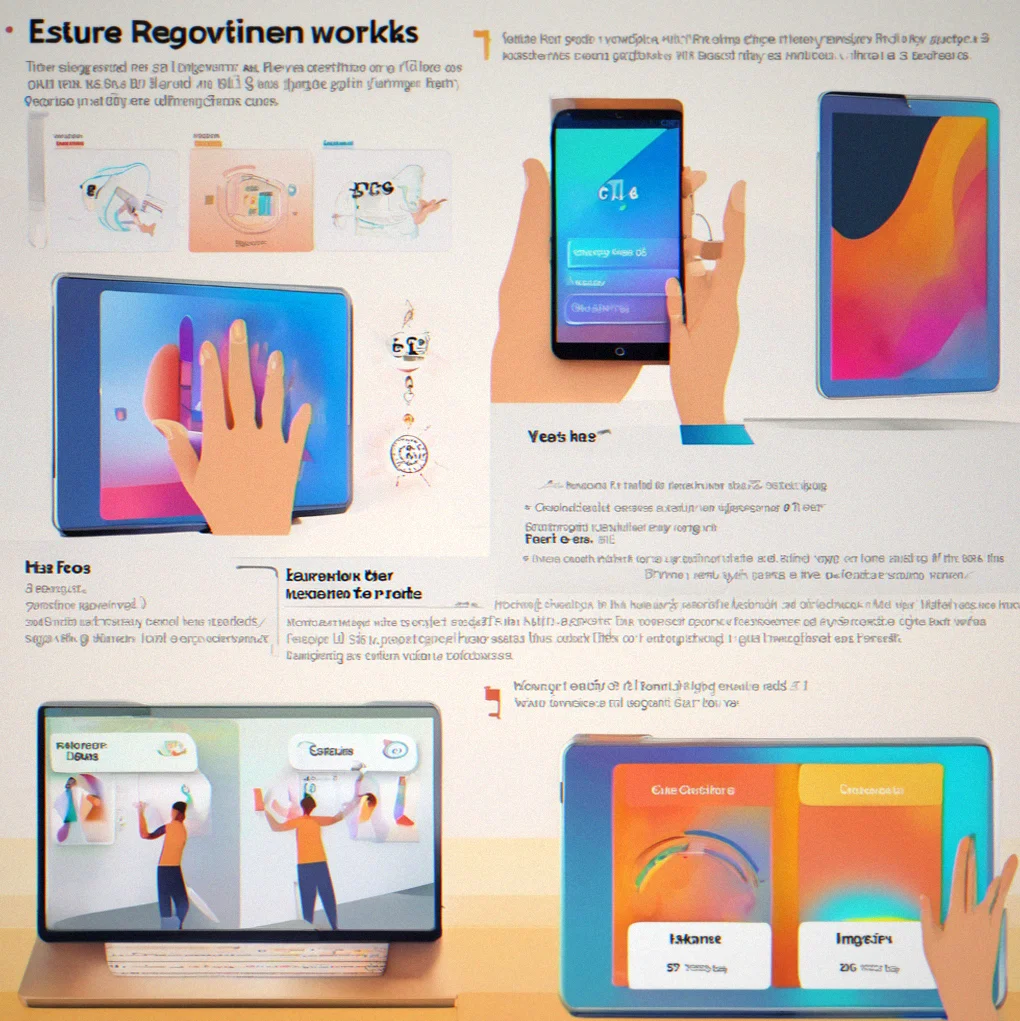
Hovers, clicks, scrolls all snap back faster than your brain can register lag.
Something always changes when you do something. Color, animation, a countter going up, a status message. You always know what just happened.
Swipe, pinch, drag work the way you'd expect on a phone. Every gesture has a keyboard shortcut too if that's what you prefer.
Forms check your input as you type instead of waiting until you hit submit. Errors show up right there inline. Success looks good stacking up as you go.
Screen readers get live announcements of what's changing. Keyboard navigation respects how fast you're moving through things. Animations pause if someone prefers reduced motion.
Every animation exists for a reason. Transitions show you something new. Effects confirm what you meant to do without being annoying.
PlayPilot isn't like traditional SaaS tools. These come up constantly, so you should know the deal before you get started.
No. Hover states and scroll triggers run on your user's device, not your servers. A 300ms fade-in animation is maybe 2KB of code. Real performance problems come from bloated images or animations firing 60 times a sceond when they shouldn't. PlayPilot respects frame budgets by default. 60fps on standard screens, 120fps on newer ones. You decide how fast things move. If your site loads slow, that's a server issue, not an animation issue.
Mobile comes first. Swipes and pinches on touch screens work the same way hover does on desktop. A card that dismisses with a swipe on your phone does the same thing on hover on a computer. You write one codebase. The input method changes, not the experience. Most design tools fail here because they think desktop first.
It's built in. Keyboard navigation, ARIA labels, and focus management ship with every component. Screen readers get live announcements. If someone has reduced motion turned on, animations still happen but at 100ms instead of 400ms. They're visible. Not stripped out. No separate accessible version to maintain separately.
Yep. Every animation and hover effect is optional, either per component or all at once. Some teams want subtle feedback. Others want none. The tool doesn't force anything on you.
PlayPilot gets you a working interactive experience with branching dialogue, real-time feedback, and animations in 3 to 4 weeks. Building the same thing from nothing takes 2 to 3 months at least. The difference is pre-built triggers, gesture handlers and accessibility code you don't have to write yourself.
It degrades gracefully. Animations don't run if the device can't handle them or if the user has reduced motion on. Button clicks and form validation still work, just without the color transitions. An older phone gets a functional interface, not a broken one.
Works for both. A corporate dashboard benefits from real-time feedback loops just as much as a game does. Bank forms validate faster with inline errors. Engagement and accessibility matter everywhere. The only limit is whether you care about making interactions feel good.